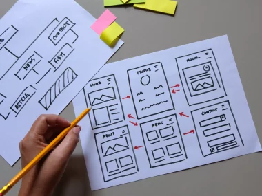
Nowadays, when most people surf the Internet through their mobile devices, it is essential that websites are optimized for different screens. Responsive design is not just a fashion trend, but an integral part of effective website development. Creating responsive websites is not only about aesthetics, but above all it is about functionality and user experience.
Why is it important to have a responsive design?
- Universal Accessibility: Responsive design allows the website to adapt to different screen sizes, meaning that users have the same access to content whether they are using a computer, tablet or mobile.
- SEO optimalization: Search engines prefer responsive websites, which can lead to a better placement in search results. This means that resposive design is not only about users, but also about search engine optimization.
- Improved User Experience: Responsive design ensures intuitive and comfortable use regardless of device. It minimizes the need for horizontal scrolling and optimizes interactions for different touch screens.
- Efficient Content Management: Programmers can easily manage and update content in one place, simplifying maintenance and minimizing errors.

Responsiveness in Tailwind CSS
Tailwind CSS, with its simple syntax and rich options, allows programmers to create responsive websites without complicated code.
Breakpoints in Tailwind CSS are specified screen sizes that allows style to be adapted for different devices. Tailwind CSS uses named breakpoints that correspond to standard screen sizes (e. g. sm for small devices, md for medium, lg for large xl and 2xl for extra large).
screens: {

sm: "640px",

md: "768px",

lg: "1024px",

xl: "1280px",

"2xl": "1536px",

},
An example of using breakpoints
<div class="grid grid-cols-1 sm:grid-cols-2 md:grid-cols-3 lg:grid-cols-4 xl:grid-cols-5 gap-10">

<!-- Obsah, ktorý bude zobrazený v rôznych stĺpcoch podľa veľkosti obrazovky -->

</div>
<h1 class="text-2xl sm:text-3xl md:text-4xl lg:text-5xl xl:text-6xl">

<!-- Dynamicky prispôsobený text pre rôzne veľkosti obrazoviek. -->

</h1>
An example of responsiveness in Bootstrap
<div class="container">

<div class="row">

<div class="col-sm-6 col-md-4 col-lg-3">

<!-- Obsah stĺpca -->

</div>

<div class="col-sm-6 col-md-4 col-lg-3">

<!-- Obsah stĺpca -->

</div>

<!-- Ďalšie stĺpce -->

</div>

</div>
Conclusion
Responsive design is not just an aesthetic addition, but a key factor for modern websites. Developers can use tools like Tailwind CSS, Bootstrap or even basic CSS to create responsive websites with wide reach and benefits for all users. Ultimately, it is an investment in an optimal experience, higher visibility and efficient development.
If you are interested in professional IT services or programming, please contant us. Our skilled team of programmers is ready to meet your requirements and to find optimal solution tailored for you.


